
reasons to hire me
I work in both print and screen. I am not defined by any particular style. I'm multifaceted. I know a lot about a lot. I don't let what I know I can and can't do define me or my ideas. I'm innovative.
contact
jeff@orsicreative.com
843.425.4519
skills
- symbolism
- layout
- typography
- illustration
- motion graphics
- ui design
- web design
- 3d
© jeffrey schierer
logos

codegrease
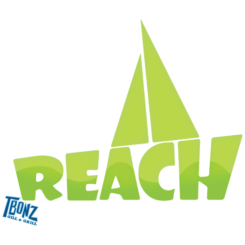
reach sailing
Reach is a sailing program in Charleston, SC that serves children of all ages and cultural backgrounds throughout Charleston County. The program serves to teach students cooperative skills as well as sailing skills. Green is used for its use in sea navigation as well as its connotation for ‘go,’ which serves to emphasize the name Reach.
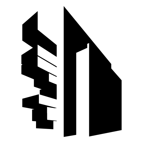
manchester civil centre (concept)
The Manchester Civil Justice Centre is known for its distinctive modern architecture. I designed a pictogram to capture the building’s distinctive architecture and modern qualities by creating a silhouette of the building that appears to have impossible lighting.
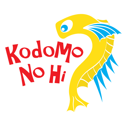
kodomo no hi (concept)
Kodomo No Hi, or the Children’s Festival, is an event held annually in Japan on May 5th. The event celebrates the virtue and happiness of children. During the event families raise carp shaped flags - one for each parent and each child. Chinese legend says a carp that swims upstream will become a dragon. Using this legend, I created a logo that shows a carp transforming into a dragon to symbolize children becoming adults.
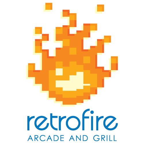
retrofire (concept)
Retrofire is a restaurant and arcade designed around the theme of old school video games. I mixed the old school video game style with my contemporary appeal to create a retro but edgy look for Retrofire. The fire suggests food, while the pixel aspect suggests video games. Clean layouts and geometric type bring modern appeal and added shadows give dimension to the brand designs.